How to work with CSS Viewport units
permalinkThese are so handy; I'm using them all the time because it's just an excellent way of having a section precise the size of the browser.
If you want to see a real world demo of this in one of my websites visit; The Todoist and scroll along the page.
What do Viewport units mean? permalink
CSS has four viewport based units we can use these are vh, vw, vmin, vmax.
- Viewport Height (vh); Meaning the height of the viewport, we can have values from 1vh to 100vh. Meaning 1vh = 1% of the viewports height.
- Viewport Width (vw); Meaning the width of the viewport and can also have values from 1vw to 100vw. Meaning 1vw = 1% of the viewports width.
- Viewport Minumum (vmin): This unit is based on the smallest dimension of the viewport. So if the height is smaller, then the width 1vmin is 1% of the height.
- Viewport Maximum (vmax): This is the same as vmin, but based on the biggest dimension.
CSS Viewport magic by demo permalink
Let me demo out what we can do with viewport units to make it easier to understand.
See the Pen Basic css viewport demo by Chris Bongers (@rebelchris) on CodePen.
As you can see in the demo we have created two sections in our HTML.
We set the width to be 100vw, which means it's 100% of the viewport's width. And the height to be 100vh, which is 100% of the height of the viewport. We then gave the h1 a font-size of 4vmax, so it will adjust according to the size as well.
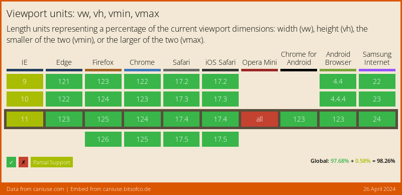
How about browser support? permalink
Good question! 🙋🏼♂️. The viewport options are widely accepted
Let me know what you think! permalink
As always, feel free to drop me a message on Facebook or Twitter!