How to use CSS position:sticky 🦎
permalinkHow to use CSS position:sticky 🦎
Position sticky is one of those things that I genuinely enjoy in CSS. Simple, easy, but makes such a difference.
You can see a demo below; scroll down and see the first image being sticky to the left.
See the Pen How to use CSS position:sticky 🦎 by Chris Bongers (@rebelchris) on CodePen.
When we scroll and usually should see the image disappearing in our demo, it will now stick to the top of that div.
How to use position sticky in CSS? permalink
Depending on the scroll position, a sticky element toggles states between relative and fixed. It keeps having a relative position until we hit a given offset, and then it acts like a fixed element.
We set the following properties on the element we want to behave sticky:
position: -webkit-sticky;
position: sticky;
top: 0px;
This tells the element it should be sticky and stick to the top.
To show some real magic, 🎩 we included some flex properties. So we can have one smaller div next to the big div.
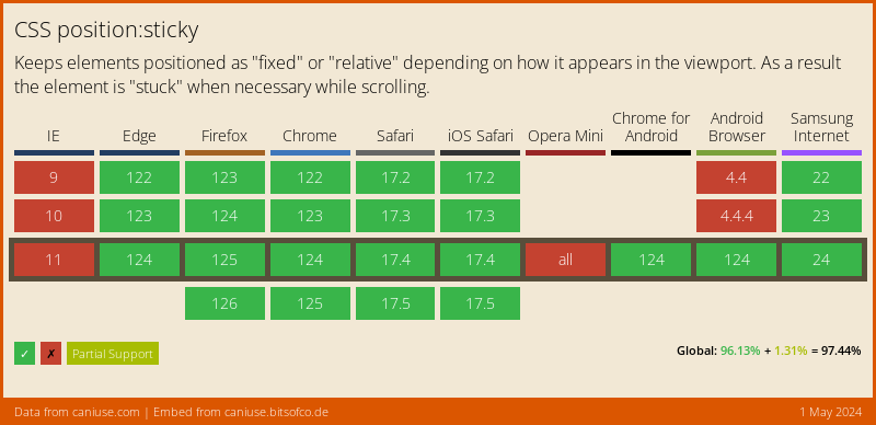
Browser support permalink
The position:sticky is widely supported, and I strongly encourage you to leverage it. One of these things adds a nice feature to your website but doesn't affect people who can't see it.
Show me how you use it! permalink
I would ❤️ to see how you use position:sticky send me a message on Facebook or Twitter with a link to your project.