CSS Disco Text
permalinkToday I will teach you, something useless, but fun! I will teach you how to create text with a disco effect in CSS.
I wanted to explore the hue-rotate function and really didn't have any better use case for it.
If you have a nice use-case drop me a message!
HTML Structure permalink
<div class="container">
  <input type="checkbox" />
  <div>D I S C O</div>
  <i>click above</i>
  <span></span>
</div>
I'm going with a very lazy solution today, and we'll use an invisible checkbox to get the party started 🥳.
Our text will be one word. It will be the star of the show. And a span element for the background effect.
Disco Text effect with CSS Hue-rotate permalink
For the text effect, the main idea is showcasing the power of the hue-rotate filter in CSS.
But let's start with the basic styling:
.container {
  position: relative;
  display: flex;
  height: 100vh;
  align-items: center;
  justify-content: center;
  flex-direction: column;
}
The most important part here is the relative position. The other is just basic centering with flex.
.container span {
  width: 100%;
  height: 100%;
  background: #efefef;
  position: absolute;
  z-index: -1;
  transition: all 0.5s ease;
}
As mentioned this span will be our virtual background, so we give it a starting grey color and position it absolute on the whole background.
We then add a transition on all effects.
.container div {
  position: relative;
  width: auto;
  background: #1d1e21;
  color: #555;
  padding: 20px 40px;
  display: flex;
  justify-content: center;
  align-items: center;
  font-size: 46px;
  cursor: pointer;
  margin: 0 4px;
  border-radius: 25px;
  box-shadow: 0px 0px 5px rgba(0, 0, 0, 0.5);
  transition: all 0.5s ease;
}
Now for our main div, it's nothing fancy, some general styling to make it look nice.
As mentioned this article uses a checkbox to turn our disco on/off, we'll make the checkbox invisible and across our whole page for easey usability.
input[type='checkbox'] {
  position: absolute;
  opacity: 0;
  cursor: pointer;
  height: 100%;
  width: 100%;
  z-index: 100;
}
Ok, on to the magic part: What happens if we actually click this checkbox:
input[type='checkbox']:checked ~ span {
  background: #333;
}
First, we make our background span a darker color to "turn the lights off"
And then we turn the actual disco text on with this CSS code:
input[type='checkbox']:checked ~ div {
  box-shadow: 0px 0px 5px rgba(255, 255, 255, 0.5);
  color: yellow;
  text-shadow: 0 0 15px yellow, 0 0 25px yellow;
  animation: glow 5s linear infinite;
}
The glow animation is where the cool disco effect takes place:
@keyframes glow {
  0% {
    filter: hue-rotate(0deg);
  }
  100% {
    filter: hue-rotate(360deg);
  }
}
There we go! This is how to create a text with animating disco colors.
See the Code example on Codepen permalink
The result is in the following Codepen:
See the Pen CSS Disco Text by Chris Bongers (@rebelchris) on CodePen.
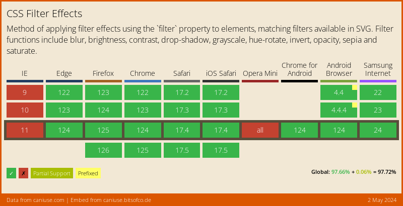
Browser Support permalink
As you can imagine, such cool CSS feature comes at the price of not supporting every browser :(.
There is a polyfill, but also limited.
Thank you for reading, and let's connect! permalink
Thank you for reading my blog. Feel free to subscribe to my email newsletter and connect on Facebook or Twitter