Adding static pages to an Eleventy blog
permalinkSo far, we have come quite a long way with our Eleventy lifestyle blog series today. We will be focussing on adding the static page, which is the about page.
Adding static pages is a more straightforward process since Eleventy will parse any site in your src directory ending in .md or .njk.
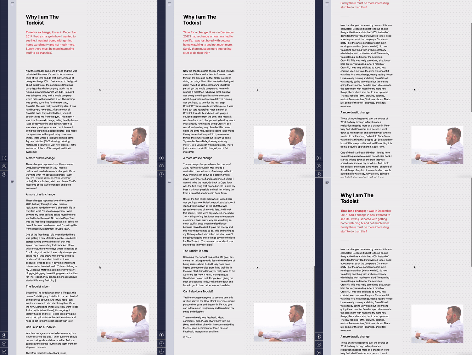
The about page we are building will look like this:

Adding an about page to an Eleventy blog permalink
Let's create an about.njk file in the src directory. I opt for a nunjucks (.njk) file since it allows us to do more styling with divs.
Inside the file, we can add the following as the header:
---
permalink: /about/
---

{% extends 'layouts/base.njk' %}

{% block content %}
  <h1>About page</h1>
{% endblock %}
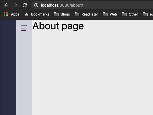
This will render the /about/ page as such.

As you can see, it's nothing like our end-goal. So let's get to it and add the markup we are going to need.
<main class="flex flex-col md:flex-row">
	<div class="w-full p-4 py-24 md:w-1/2">
			<!-- LEFT SIDE -->
	</div>
	<div class="sticky top-0 flex items-end w-full h-auto p-4 py-24 text-white md:h-screen md:w-1/2 bg-pattern-dots">
	  <!-- RIGHT SIDE -->
	</div>
</main>
We start by using the <main> element to wrap everything in.
Inside we have two half-width columns. The left one is pretty plain. It only has some extra spacing.
The right one, however, is quite interesting. It used a sticky position and is made to fit the exact screen. I then use the flex-end class to place the image at the bottom. We also introduce a new background called bg-pattern-dots.
To add this new pattern, we must modify the tailwind.config.js file once more and add the following:
backgroundImage: {
	"home-1": "url('images/home-intro.jpg')",
	"pattern-striped": "url('images/pattern-striped.png')",
	"pattern-dots": "url('images/pattern-dot.png')",
},
As for the left column, we use an <article> wrapper with another vertical spacing. Inside we can put all our content.
<article class="mx-12">
	<h1 class="mb-8 text-4xl font-bold">Why I am The Todoist</h1>
	<p class="text-xl text-pink"><strong>Time for a change;</strong> It was in December 2017 I had a change in how I wanted to see life. I was just bored with getting home watching tv and not much more. Surely there must be more interesting stuff to do than this?</p>
	<hr class="w-2/12 my-12" />
	<p>The other content...</p>
</article>
The right column uses a similar approach for spacing, but it's using a <aside> element.
<aside class="mx-12">
	<img src="/images/about.jpg" class="w-full shadow-xs">
</aside>
This will result in the following:

You can find today's code on GitHub.
Thank you for reading, and let's connect! permalink
Thank you for reading my blog. Feel free to subscribe to my email newsletter and connect on Facebook or Twitter